Good UI doesn’t increase freedom. It leaves only the right decisions.
Good UI doesn’t increase freedom. It leaves only the right decisions.
Posted by: Dave Lee
When people talk about UI design, a common assumption often appears:
“Isn’t it better if users can customize everything themselves?”
At first glance, it sounds reasonable. Choosing colors, adjusting styles, and controlling visual details feels empowering. However, in practice, this approach often leads to worse user experiences rather than better ones.
In UI design, choice is a cost
Every choice in a user interface carries a cost. That cost may be time, attention, or decision fatigue.
Selecting button styles, adjusting spacing, or comparing visual options might feel natural to designers, but for most users, these decisions create friction. When individual choices begin to affect each other, the result often feels unbalanced. Elements may look acceptable on their own, yet awkward when combined into a single screen.
Why heavy customization often fails
UI is not a collection of independent elements. It is a system.
Colors affect contrast, buttons imply hierarchy, and spacing determines readability.
The problem is that users are rarely equipped to consider all of these relationships at once. Partial freedom easily breaks overall consistency, leading to results that feel “off” without a clear explanation. This is why many highly customizable interfaces fail to deliver satisfying outcomes.
Good UI systems define what users should not decide
Strong UI design starts with a different question.
Not “What should users customize?” but “What should the system take responsibility for?”
In UI design, emotional and identity-related elements are often the safest areas for user input. Structural elements—layout, hierarchy, spacing, and interaction rules—produce better results when handled consistently by the system.
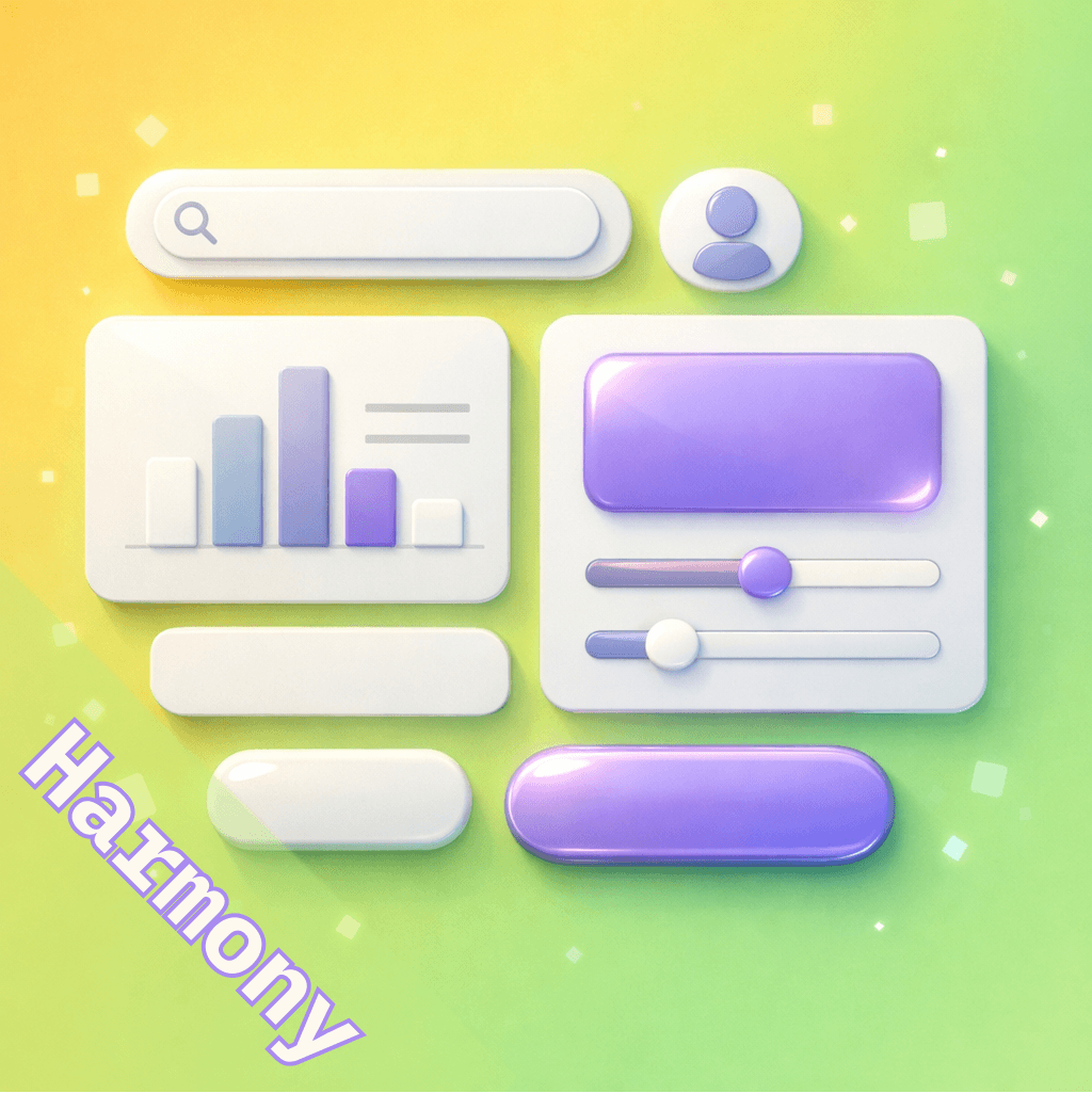
Why color selection works
Color is one of the most intuitive ways for users to express brand identity. It influences the overall tone of an interface without directly breaking its structure. For this reason, many design systems allow color customization while keeping other elements fixed.
A limited palette—such as Primary, Secondary, Error, and Neutral colors—is not a restriction. It is a shared visual language that maintains consistency while still allowing personal expression. Within this boundary, users feel ownership without sacrificing design quality.
The approach AppBuildChat takes
AppBuildChat applies this principle directly to UI design. Customers can choose a small set of core colors for their app. All other UI elements—layout, spacing, button styles, and hierarchy—are designed by a combination of AI and human judgment.
This approach balances two important goals. Users can express their brand through color, while the system ensures visual consistency and usability. If the result doesn’t feel right, feedback leads to refinement and adjustment. In practice, many customers find that the outcome feels better than if they had designed every detail themselves.
Conclusion: good UI reduces decisions
Good UI design does not ask users to make more choices.
It asks them to make fewer, more meaningful ones.
When unnecessary decisions disappear, interfaces feel stable and natural. That sense of stability is where good UI truly begins.